Thought Leadership
Improving the Visibility and Management of Operational Data
How to Manage and Integrate Data for Improved Efficiency
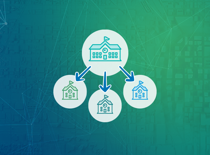
We regularly get inquiries from clients that want to manage or view data, usually nonspatial data such as data in spreadsheets or external systems that are siloed or located in databases controlled by other departments. Examples of siloed data can include inspections, permitting, sampling, or cemetery records.
When the organization has GIS and an enterprise geodatabase and other databases in the same environment this becomes an opportunity to leverage database views. Nonspatial data that regularly comes in from outside can be handled in a similar fashion, which can make data management easier to deal with or automate.
Case Study: Managing Water Sampling Data for Woodinville Water District
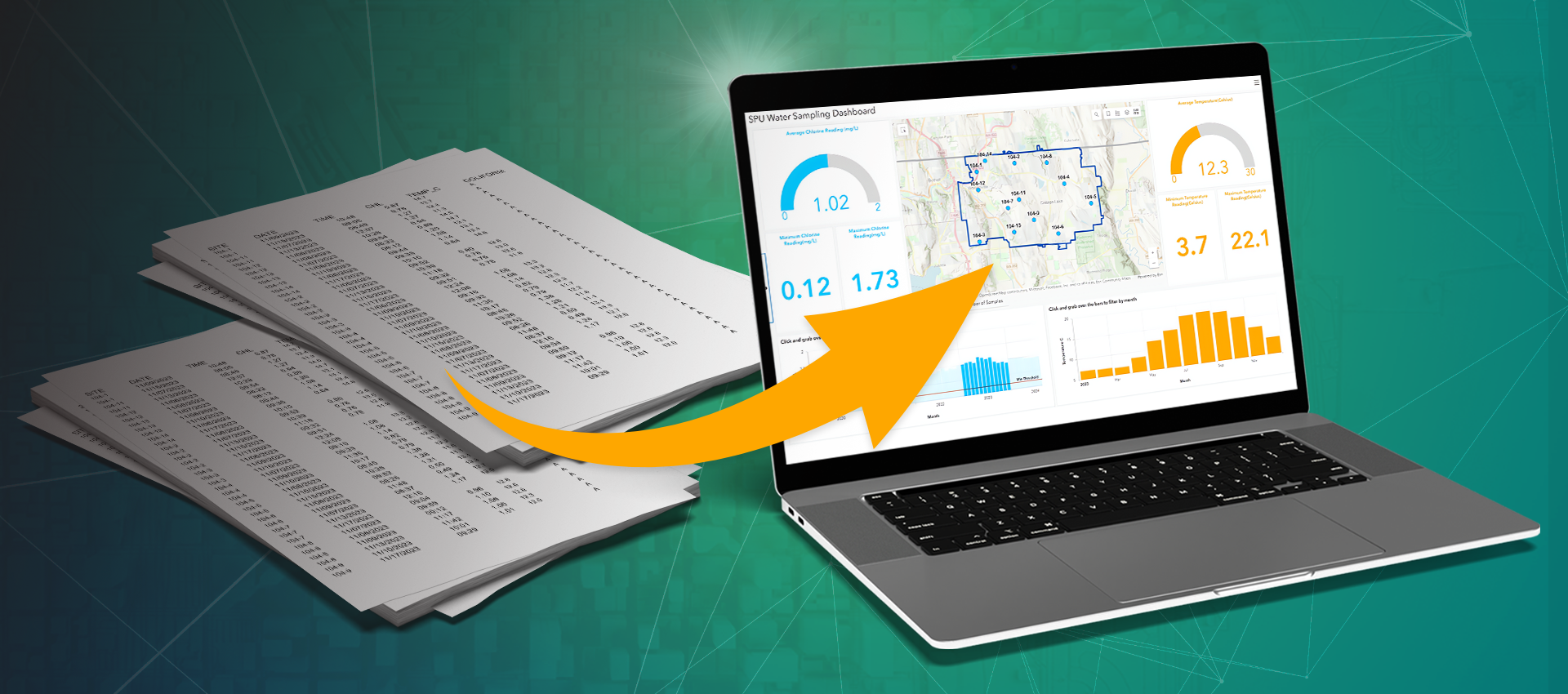
Woodinville Water District regularly receives water sampling results from Seattle Public Utilities in tables, comma-separated values (csv), or Microsoft Excel formats. The agency needed a good way to manage this data and view the results in an easy-to-use fashion. Staff wanted to be able to quickly see the minimum and maximum range of results for a given period, as well as highlight sites that had exceeded the established limits. With many samples received every month, it was important that the process to incorporate new records was easy to manage and not require additional work each time. As the District already had the GIS data for the sampling locations and Esri ArcGIS Enterprise, it made sense to use that platform.
A Tailored GIS Solution for Data Integration
Working with the District, we created a table in our enterprise SQL Server geodatabase to store the results from the sampling events. As new sampling results are received, the table is updated following some basic review and processing. A customized view allows us to add this data to a map. To simplify finding and reporting the data, the view also generates some custom fields, such as extracting the sample location number from the name for more intuitive sorting and converting some fields specifically for dashboard widget use. 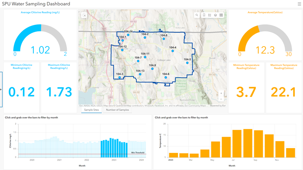
The view is then published through ArcGIS Enterprise and brought into an Esri dashboard. The data structure supports tools within the dashboard, including generating summary statistics, charts, and, of course, the interactive map. As new sampling data is loaded into the data table, the view is automatically kept up to date, reducing internal data maintenance efforts. GIS staff can bring the view into ArcGIS Pro to do more advanced querying, mapping, or analysis. The new dashboard has been welcomed by water quality staff, as it makes it easier to visually see exceedances or issues while allowing a deep dive into the details if desired.
If something like this sounds like it might be of interest to you, feel free to reach out for a conversation as to how we can help make it happen.
Contact
Government Inquiries
Thanks for your interest in FLO. Whether you are looking to start a project, get support, or just have a general question, we'd like to hear from you. Please reach out and we will get back to you.

Share this article on social media/email
Author